← All work · Cheche Flowers
Unique and fresh, from logo to packaging.
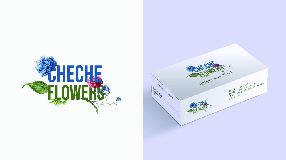
We designed the logo and packaging for Cheche Flowers.
Cheche Flowers was started in 2019 through extensive research to grow the best qualities of summer flowers, offering natural, authentic blooms that compete in the market. The company is also geared towards improving the livelihoods of small-scale farmers by increasing a market niche for them.
- Client
- Cheche Flowers
- Started
- 2019
- What we did
- Logo & packaging design
- Delivered
- Identity handbook
Chapter 1
A logo in full bloom
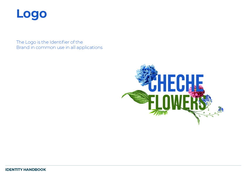
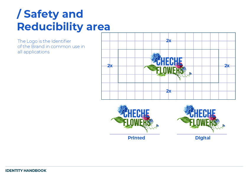
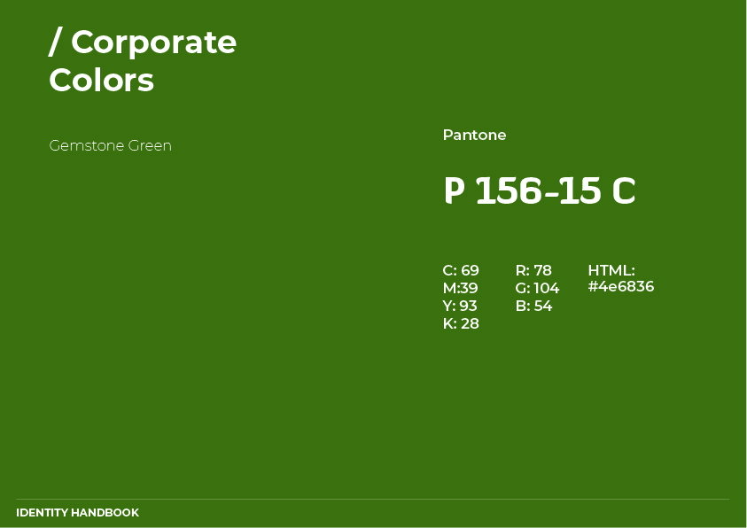
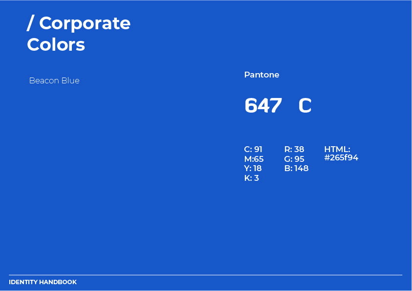
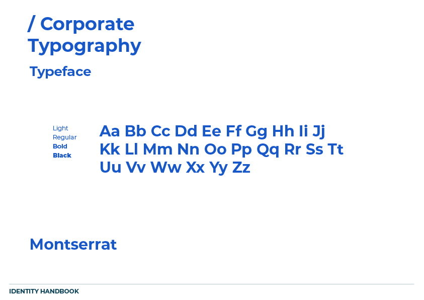
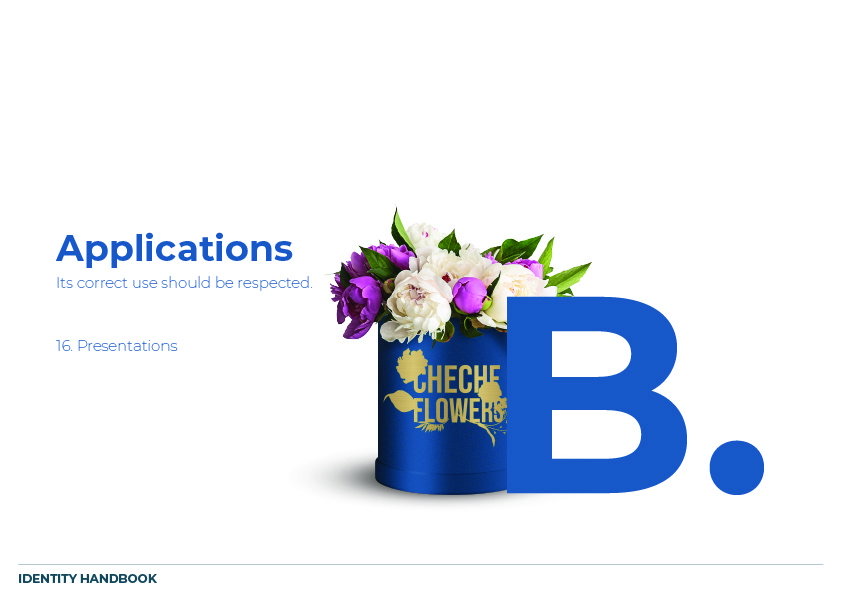
The logo wraps illustrated flowers and leaves around a bold, stacked wordmark. Beacon Blue and Gemstone Green carry the identity, set alongside Montserrat as the brand typeface.
Chapter 2
Packaging and beyond
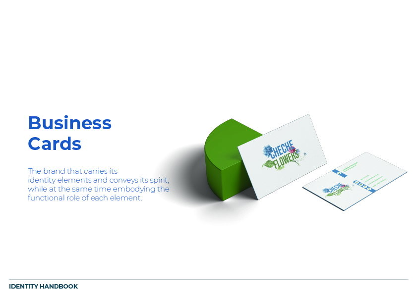
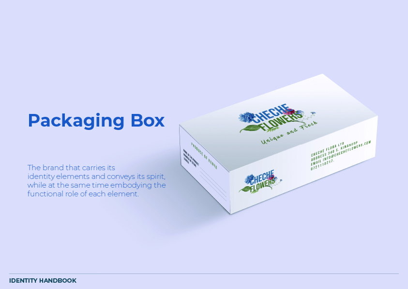
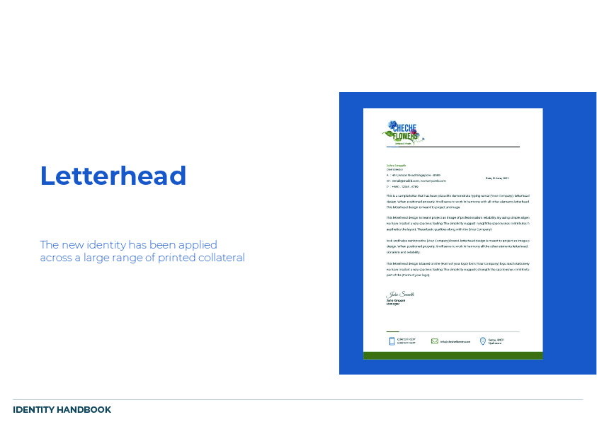
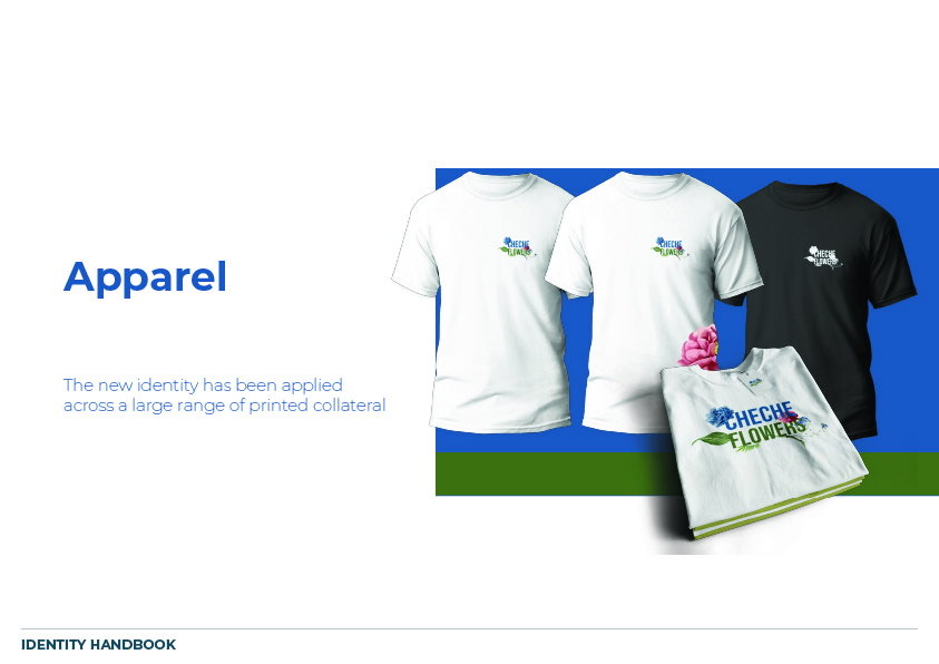
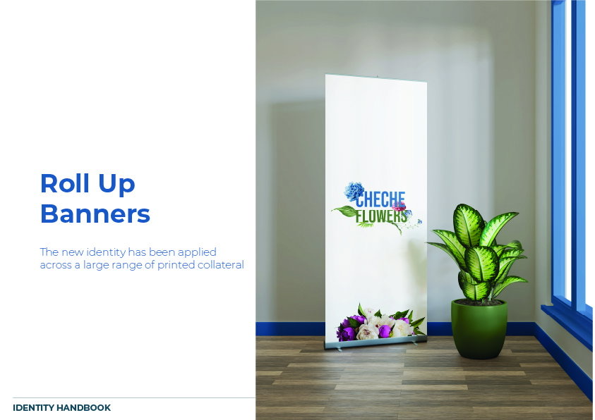
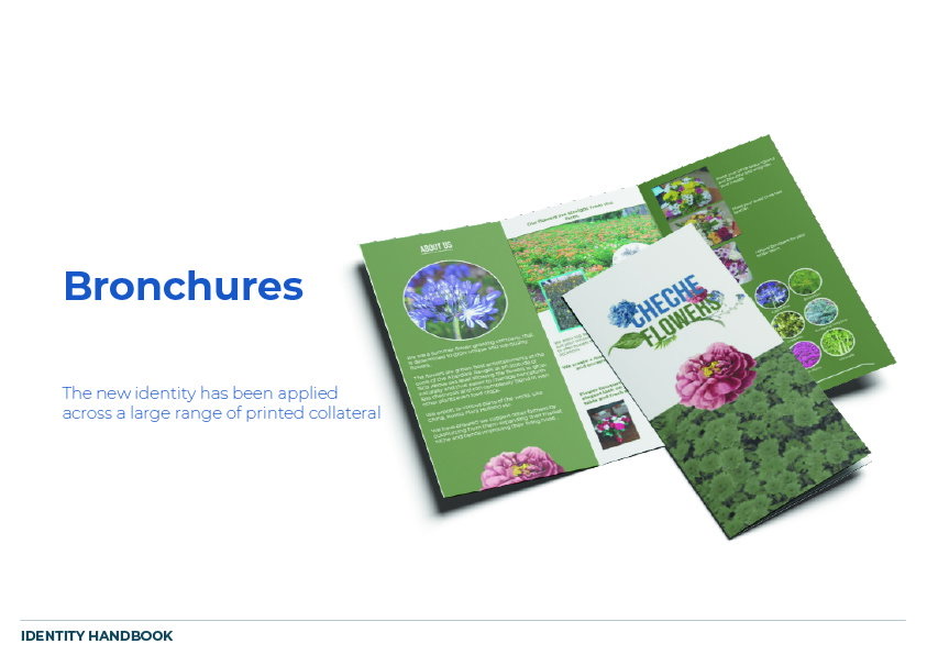
The packaging box carries the logo with the line "Unique and Fresh". The identity also extends across business cards, letterheads, apparel, roll-up banners and brochures.
The identity handbook
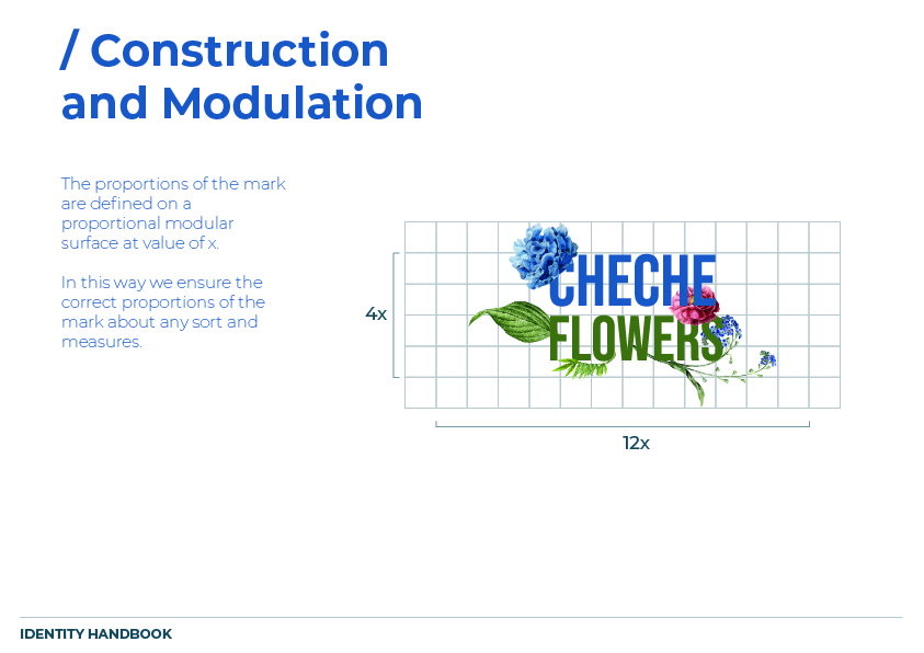
From the handbook
Launching a product or a brand?
We design logos and packaging that make your brand impossible to ignore.