← All work · AirKenya
One brand, from the sky to the ground.
We created AirKenya's brand guideline — the rulebook that keeps the airline looking like itself on every surface, from a single logo to an entire fleet.
The guideline sets out how the logo is built and how the brand is applied to aircraft and ground vehicles, so every team and supplier works to the same standard. What follows is a short preview of a few pages from the full document.
- Client
- AirKenya
- Industry
- Aviation
- What we did
- Brand guideline
- Applications
- Logo, aircraft livery, ground fleet
The document
A guideline built to be used.
Clean black-and-white pages, a clear grid and plain language make each rule easy to find and hard to misread — whether you're a designer, a signwriter or a livery painter.
- Logo construction
- Lockup rules
- Aircraft livery
- Ground fleet
Chapter 1
Logo construction
The AirKenya mark is an "A" with a sunbird built into it — wings sweeping up and out, body and tail curving down to form the base of the letter. The guideline locks the icon, the AIRKENYA wordmark and the tagline "The best way to fly" into one fixed lockup, built on a 13 × 13 grid so it scales without ever losing its balance.
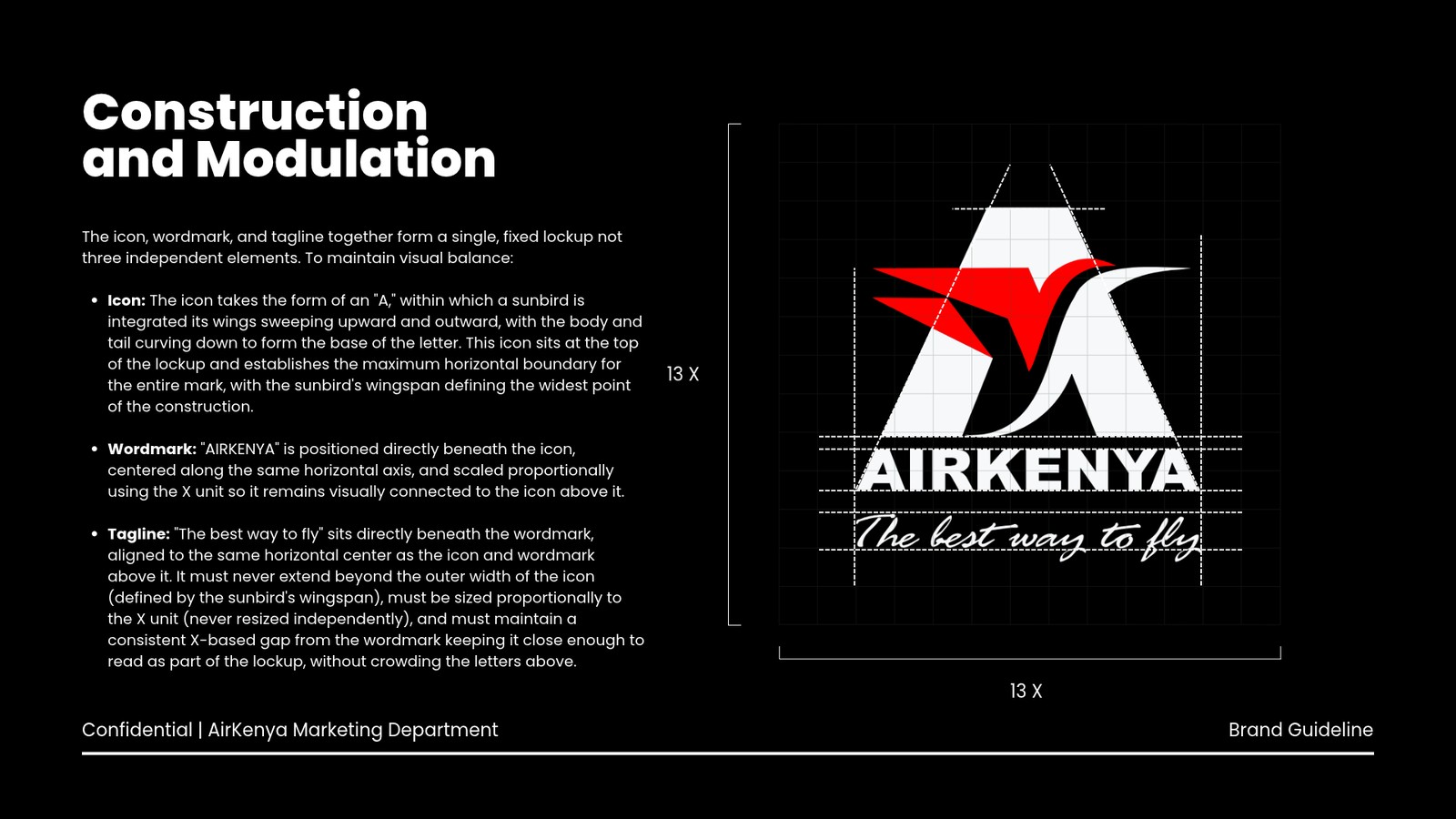
- 01IconSets the top of the lockup; the sunbird's wingspan is the widest point of the whole mark.
- 02WordmarkSits directly beneath the icon on the same centre line, scaled to the X unit.
- 03TaglineNever wider than the wingspan, never resized on its own, always the same gap below the wordmark.
Chapter 2
Aircraft livery
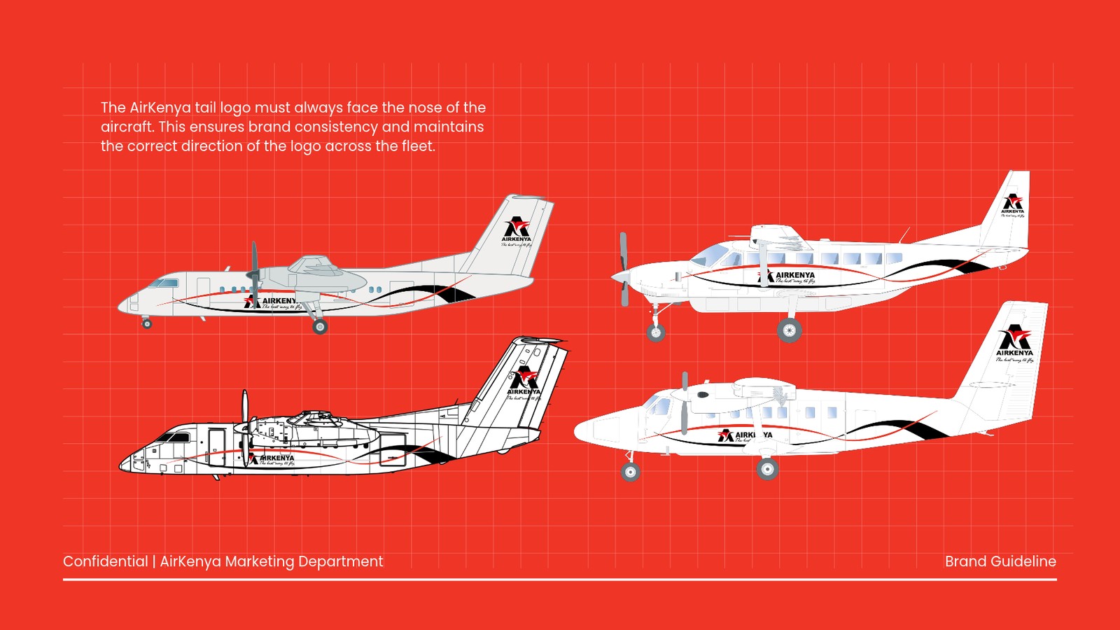
A red-and-black ribbon runs the length of each fuselage, with the full logo on the tail. The guideline shows the livery on four aircraft types in the fleet and fixes one simple rule: the tail logo always faces the nose of the aircraft, so the brand reads the same way on every plane.
Chapter 3
On the ground
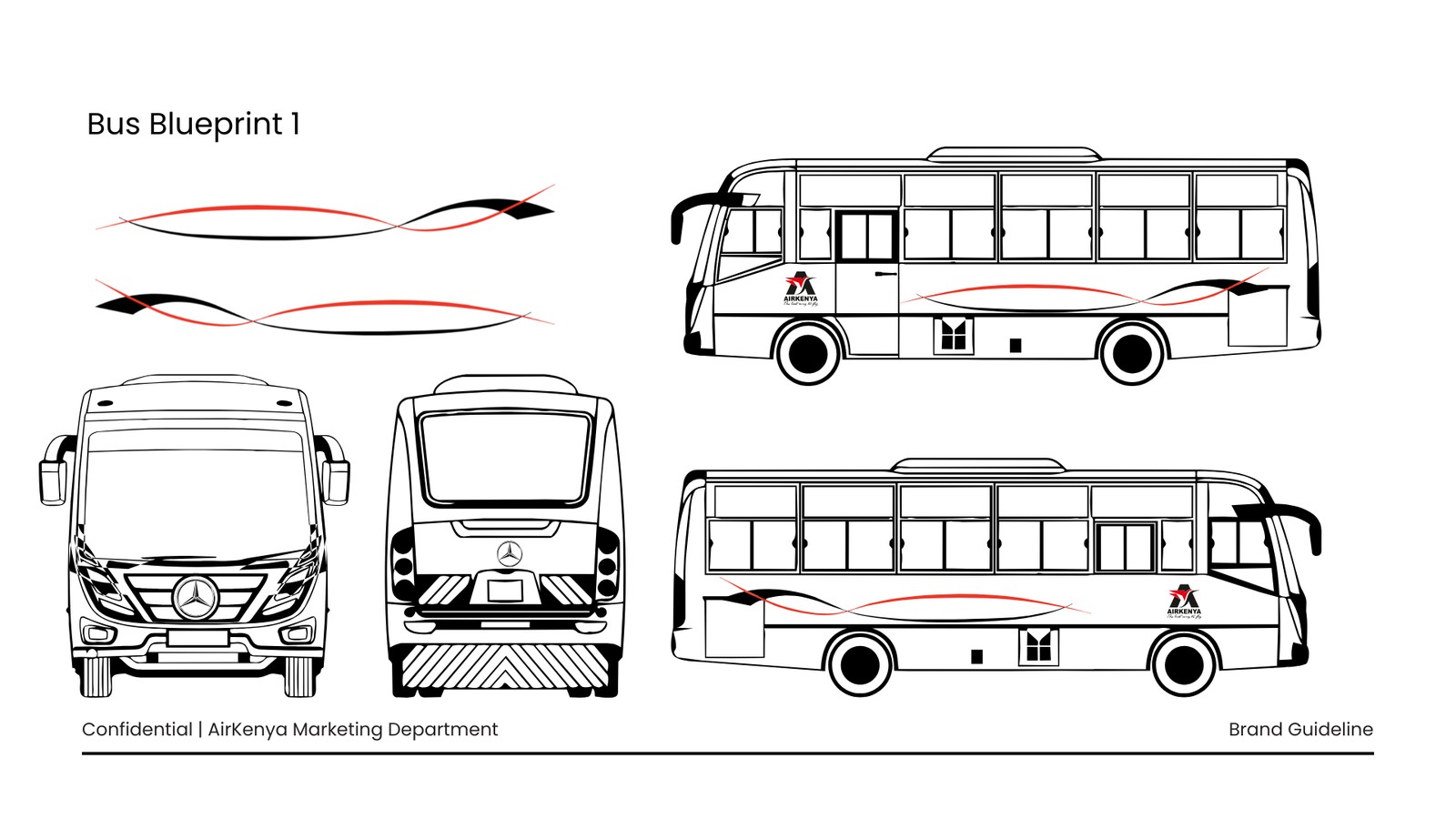
The brand doesn't stop at the runway. We adapted the same ribbon for AirKenya's buses, with blueprints for the front, rear and both sides, plus mirrored versions of the ribbon so it always flows towards the front of the vehicle — matching the aircraft rule.
Need a brand guideline of your own?
We'll build the rules that keep your brand consistent everywhere it shows up.